berylkong

Sunday, August 20, 2006

Reflection on the Final Assignment

Thanks to all for giving us so much positive feedbacks to improve our work!

We have found that the comments from our coursemates were mostly centered on the interface of “Let's play a song”. Perhaps the idea of playing song is too dominant in this learning object, most people seem to be sidetracked by it which is not our desire. In order to make the balance between the educational message and entertainment, we tried to minimize gimmicks in the interface of “Let's play a song” as far as we could, and emphasized on “learning” in this learning object.

Besides, as suggested by Daniel, a single interface acts as one access point to most information was regarded as the best design in learning objects , we had actually taken the risk not to use one single interface as we planned to do at the very beginning of the formation of this idea. However, one single interface in our case was not easy to achieve. We did our best to design the two similar layouts for the two interfaces instead. The two different interfaces take different roles. We found that the design of the both interfaces looks consistent, harmony and unity.

Regarding Chris' suggestions on diverse ways to taking the experiment, we had considered more alternative ways for students to produce sound with different pitch, such as blowing the glass tube or hitting the glass tube. The two different methods would actually produce sounds with opposite pitch. As a result, we kept the method we used to.

We had made efforts to produce the sound ourselves to make the LO authentic. We had difficulties to produce pitches with great difference. The glass tube was not long enough. We went back to the school laboratory but there was only a long plastic tube which did not produce sound properly. Because of the limited time and the hard work with using Macromedia Flash to work on the modifications; we accepted the pitches with slight difference only in the end.

Nevertheless Macromedia Flash was really difficult for us. We had tried our best to design and draw using the software to accomplish this task. With the idea of Daniel’s demo and technical support from a friend of ours, eventually we have got it! Thanks, Daniel!

Final assignment

Theme: Sound (Created by Beryl and Peon)

Target audience: Primary 5 students

The purpose of the project:
This topic is chosen because it shows the relationship between pitch and vibration of substances. This is an important concept because sound is all around us; in music, in speech, and in nature. Different instruments produce different pitches.

The objective: To conduct an investigation of factors affecting the pitch of sound


For the source code file, please click here.

Elements of Good Communication in Teaching and Learning.
Learning Object (LO)
Learning Object is an effective educational resource. It is a representation designed to afford uses in different educational contexts (Daniel, 2005). Learning object should be mainly for educational use with the following components:

a. Effective subject-matter analysis,
b. Multimedia communication,
c. Human learning,
d. Effective screen presentation and interface design (Daniel, 2005)

LO is an effective tool to communicating educational messages to students. Based on Daniel’s definition and classification of LO, our interactive representation should be categorized into Information Object.

The parameter
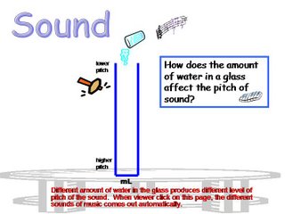
There are two main visual interfaces in our learning object. In both interfaces, students will be involved in exploring the relationship between pitches produced with different length of water column. A long water column generates low-pitched sound, and vice versa; short water column generates high-pitched sound.

The Interactivity
Different pitched sounds generated with different volume of water are synchronized with the different musical notes. Indeed, it is the main characteristic of this LO. We presented this idea in the different way in the two interfaces.

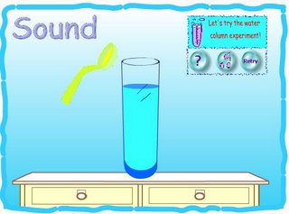
In the interface of “Let's try the water column experiment”, we view this as the area of "exploration" as we aimed to make students focused on exploring the pitch of sound itself. Hence, when clicking on the interface there is only one big glass synchronized with musical notes of the sound automatically.

In the interface of “Let's play a song”, we regard it as the area of “Fun”. It shows more interactivity. Interactivity offers more opportunities of control over the speed, pace, and order of information exploration. It makes the power of personal inclination so appealing to viewers. Besides, interactivity serves as extrinsic stimuli to motivate students’ learning (Graham, 1999). The eight glasses with different volume of water representing different musical notes are served as buttons for viewers to play songs freely. It allows students deeply involved in work which is based on their own ideas and they take part in deciding how to do it (Nuffield-Chelsea Curriculum Trust, 1993).

According to Piaget's theory, students at the age of 6 to 12 are in the Concrete Operations Period. They are still not good at deductive logic. Materials should be presented with more concreteness to learn scientific concepts. More hands-on experience and inductive experimentation should be provided to them (Bee, 1992, p. 265). Therefore, playing with music is really a good idea for students to consolidate their learning with fun.

Quiz
Framing a question is a way of instructional cues or stimuli that make students learn the content (Cotton, 2001). In order to ensure that students have mastered the concept, we provided a quiz pop-up box that comes with the options of answer. Immediate answers are provided accordingly.

Good user interface design
The two key elements in good design are:

Simplicity of design to represent Complexity of information (Tufte, 1983, p. 177)
Effective screen design can offer visual communication that transmits a message in an attractive way (Phillips, 1997). A clear presentation can enhance communication (Graham, 1999, p. 6).
The following essences of user interface design can speed communication:

1. Intuitive interface (Graham, 1999, p. 6)
Student can intuitively explore the concept of the content by clicking or mouse over throughout the two user-friendly interfaces.

2. Effective layout
An effective layout makes complicated information to be clearly understood. We had adopted “Z layout pattern” which is one of the standard screen layouts that directs viewers’ eye in well-balanced way to other parts of a screen. (Phillips, 1997, p. 81)

3. Consistent format (Graham, 1999)
Phillips (1997) stated that too much variation can cause confusion. We made the interface format to be consistent (Phillips, 1997, p. 81). As a single interface acts as one access point to most information is regarded as the best design in learning object (Daniel, 2005), we did not just make it consistent, but tried to imitate it to be one single interface.

4. Efficient navigation support
a. Three click rule
Good interactive design should not make too many levels of interactivity. We did use the way of no more than three clicks away from the first click which is a good way for viewers to navigate throughout the different layers of the interactivity (Graham, 1999, p. 60).
b. Clear interactive controls
As the design of interactive controls is crucial to the success of the interface design (Graham, 1999, p. 60), we adopted clear and consistent interactive controls by the following modes (ibid., p. 61):
-By analogy:
Using a symbol of “?” as the button, students can easily understand that it is analogous to the word “question” that represent the “quiz” button.
-Via context cues and self exploration
Using the typeface of “Retry” and “Quit” as the buttons, students can guess the meaning by further exploring with context cues.
-By using different kinds of button.
We had used the types of buttons, such as clickable buttons, rollover buttons, mouse over buttons, animated buttons.
c. Navigation box
A navigation box is placed on the top right corner of both interfaces so that the interactive control is consistently kept.

5. Learning with Fun
Offering fun experience can gain viewers’ attention. The best design in the interactivity engages viewers’ interest and participation. (Graham, 1999, p. 29). When students play with the interactive glasses with musical notes of the sound, “Let's play a song”, it engages students' participation with fun.


References:
Bee, H. (1992). The developing children. (6th ed.). New York: HarperCollinsCollege Pub.

Churchill, D. (2005). Towards a useful classification of learning objects. In press.

Cotton, K. (2001). Classroom Questioning. Retrieved August 17, 2006, from
http://www.nwrel.org/scpd/sirs/3/cu5.html

Graham, L. (1999). The principles of interactive design. Albany, N.Y.: Delmar Publishers.

Phillips, R. (1997). The developer's handbook to interactive multimedia : a practical guide for educational applications. London: Kogan Page.

Nuffield-Chelsea Curriculum Trust. (1993). Nuffield primary science, key stage 2: science processes and concept exploration: sound and music. London: Collins Educational.

Tufte, E. R. (1983). The visual display of quantitative information. Cheshire,Conn.: Graphics Press.

Friday, July 28, 2006

Prototype of “Sound”

Prototype of “Sound”
Created by Beryl and Peon.


The focus question of this learning object:
“How does the amount of water in a glass affect the pitch of sound?”

Tools and resources we have used:
l Macromedia Flash MX and Macromedia Flash Professional 8
l Ulead GIF Animator 5.05
l Microsoft PowerPoint
l Microsoft Clipart Online
l Media sound recording

Difficulties that we have encountered:

1. As we were not familiar with the Macromedia Flash and it was really difficult to use the different functions for the interactivity available with the software, we needed to seek technical help from others indeed. Fortunately, we still manage to perform simple tasks such as some basic drawings, animated images used with GIF Animator and sound recording.
2. We did not have a long glass tube so that the sound produced did not show a great difference in pitch.
3. In the prototype, we have made a big mistake that we put the sound in the wrong order with the different volume of water. We will rectify this later.

Further modification of the prototype will be carried out. Any suggestions from you will be beneficial to our final product. Thanks!

Final version of our story board

Final version of our storyboard
Created by Beryl and Peon.
Please take a look!


PowerPoint

After collecting the comments in relation to the both versions from our friends, colleagues and coursemates and students and kids, the final version of our storyboard for our project has been made and based on the following considerations:

Version 1 vs Version 2
More interesting vs Higher educational and experimental value

For the version 1, it is more interesting and most people like this idea, but we find that this LO easily directs viewers to just take it as a musical instrument rather than an scientific experiment.

For the version 2, most people do not pick this version because it is less interesting. But when we asked them what they had learned from this LO, they could articulate it at once.

Therefore, in order to strike the balance between the entertainment, and educational and experimental value of LO, we combine the concepts of the both versions into our final version of our project.

Our prototype is coming very soon!

Thursday, July 06, 2006

The storyboard of our final project

We have drafted two versions for the storyboard of our final project. We have not decided which one is better. Please give us suggestion. We treasure your opinions. Thanks!


Version 1


Version 2


These 2 versions are created by Beryl and Peon.

Thursday, June 29, 2006

The preliminary plan for our final project: a learning object

The preliminary plan for our final project: a learning object
Drafted by Beryl & Peon

Theme: Sound

Question: How does the amount of water in a glass affect the pitch of sound?

Subject: General Studies

Textbook: New general studies: Light, sound and electricity. Primary 5, Book 3. Educational Publishing House Ltd. (2004)

Target audience: Primary 5 students

The purpose of the project:
This topic is chosen because it shows the relationship between pitch and vibration of substances. This is an important concept because sound is all around us; in music, in speech, and in nature. Different instruments produce different pitches.

The objective: To conduct an investigation of factors affecting the pitch of sound.

Method:
1. Inquiry approach:
With the hands-on learning materials, pupils can learn through activities. Their inquiring and problem-solving skills are also developed and enhanced through these activities.
2. Interactive learning:
Instead of didactic approach, diversified learning activities are used. Pupils can learn the knowledge and skills through interacting with the learning object.

Tool: Flash

Thursday, June 22, 2006

Task 4 - Design a simple learning object

Theme: Shape of a Raindrop

Tool: Photo Impact, Microsoft PowerPoint.


This simple learning object is designed by Beryl and Peon.

Has a clearer look, please mouse over the image.

The attached summary shows the idea that we have in the development of this learning object. Please click here.

Tuesday, June 13, 2006

Construction of Angles and Parallel lines in Geometry

I thought that Photostory is amazing. It is handy and easy to use. I used the software to make a short video about the construction in Geometry including parallel lines, perpendicular lines, and constructing angles of 60 degrees and 90 degrees. Bisection of an angle is also included.


Every year, I have difficulty in teaching some construction topics in mathematics. While I am doing the construction demonstration on the board, it is very difficult to give a hand to those students who have problems in following my steps. I have tried to take a video about the construction of different angles some years ago. I have big trouble in doing that as I needed to make the arrangement with the AV technician and booked the necessary equipment. Even though it is only for 2 to 3 minutes show, we spent hours to make the preparation and the recording. Then we needed to add the narration. The effect was not good and it took too much time using the traditional way to make educational video. It was the only trial to make my own educational video.

Taking digital pictures will be much easier. I could retake some of the pictures when I discovered that some pictures are not good enough. I did all this at home with the help of my very young daughter to hold the ruler, pencil and compasses for me. I finished the photos within 20 minutes. Then I retook some pictures later when I found some pictures not satisfactory. It is really convenient to make videos using pictures only. The insertion of narration is also very simple. It allows correction and editing immediately. I can make many more educational videos later with this software.

Our students need to produce projects in various subjects with multi-media function. They needed to produce a video in doing some experiments. They have to take video when interviewing some guests. This is a very good idea to use this software to make video with pictures only. It is because their skill of taking video is very bad and the quality of video is low. However, taking pictures will be easier.

For the media player version, please click here.

Thursday, June 08, 2006

Reflection on session 2: Good graphic design to facilitate dissemination of information

Steiner (1997, quoted in Allen, 1997) stated that enrichment in artistic education in childhood can contribute to their life-long openness to experience, to the intensity of their vision, and to their ability to test the boundaries of the known and the familiar. However, schools in Hong Kong do not value the subject Visual Art in the whole curriculum.

In fact, we are flooded with information which comes into different format. We need to the skills to use graphic as well as to understand it. A good design of graphic will help us to disseminate information in a more effective way. A good design of graphic will save us time to read and facilitate the understanding of it. As a teacher who acts a facilitator of learning of students, mastery of the skills of graphic design of information is not only beneficial, but necessary.

An information-oriented, systematic graphic design should help people understand complex information. Successful visual communication through information-oriented, systematic graphic design relies on some key principles of graphic design (Martin, 1993).

Principles of User Interface Design (Martin, 1993)
There are three fundamental principles involved in the use of the visible language.
Organize: provide the user with a clear and consistent conceptual structure
Economize: do the most with the least amount of cues
Communicate: match the presentation to the capabilities of the user.

1. Organize: Consistency, screen layout, relationships and navigability are important concepts of organization.

2. Consistency: Same conventions and rules should be applied to all elements of the design.

3. Layout: A grid structure can help locate menues, dialogue boxes or control panels. The screen should be less cluttered and easier to understand.


4. Relationships: Linking related items and disassociating unrelated items can help achieve visual organization.


5. Simplicity: Simplicity includes only the elements that are most important for communication. It should also be as unobstrusive as possible.


6. Clarity: All components should be designed so their meaning is not ambiguous.


7. Emphasis: The most important elements should be easily perceived. Non-critical elements should be de-emphasized and clutter should be minimized so as not to hide critical information.


8. Readability: display must be easy to identify and interpret, should also be appealing and attractive.


These principles can give me guidelines when I make design for the teaching aids.

Reference:

Allen, A. (1997). The polemics of visual thinking. Retrieved June 5, 2006, from
http://pages.slc.edu/~ebj/minds/student_pages/adrian/index.html .

Steiner, John. (1997). Notebooks of the mind: explorations in thinking. New York and
Oxford: Oxford University Press.

Effective Visual Communication for Graphical User Interfaces
by Suzanne Martin


Martin, S. (1993). Effective visual communication for graphical user interfaces.
Retrieved June 6, 2006, from
http://web.cs.wpi.edu/~matt/courses/cs563/talks/smartin/int_design.html.

Task 2 - design a visual display

Task 2 - design a visual display
Theme: Atmosphere


This visual display is designed by Beryl and Peon.

Have a clear look, click here !